I used a weird sized photo (4 x 7.25 or something weird like that!) and lined up circles that I cut from project life cards above and below the photo. I love how it turned out!
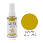
I added some tiny journaling in the bottom left corner along with some puffy hearts, enamel dots, and of course my beloved Heidi Swapp gold color shine. :)
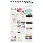
I was happy to be able to use the adorable girl icon. I thought I'd never use it, but it turned out working perfectly for this layout about some of my favorite ladies.
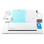
I cut my title out on my Silhouette Cameo and painted it with some watercolors. I also added some thin foam adhesive under some of the circles and I am addicted to that stuff.
My Shimelle roller date stamp and a little satin bow from CTMH finished off this layout.
If you want to see how this layout came together, check it out on my YouTube channel or view it here:
I've linked to the products I used below. Let me know if you have any questions and I'd love to see how you use dies + project life cards!
As always, thanks for stopping by!
SUPPLIES (affiliate links)








This is a fantastic way to use your cards! Love the look of this layout <3
ReplyDeleteThis comment has been removed by a blog administrator.
ReplyDeleteWhat font is the title? Thanks, love the layout!
ReplyDeleteAlison, it's called Stars from Our Eyes. You can get it on dafont.com. Isn't it gorgeous?
DeleteThanks for your sharing and i get many useful information from your post. PLease visit site profile picture
ReplyDeleteAsian Wedding Planners & Event Management Specialists Asian Wedding Photographer
ReplyDelete