One way to make layouts created from a kit look dissimilar, is to pull just a few colors from the papers and embellishments. This week, I pulled blues and yellows because these photos of my adorable nephew and his daddy had a lot of blue and green in them. Next week, I'll pull other colors to show you how you can get a distinctive look on each layout.
This layout is also a good example of how you can stretch your supplies. I didn't use a ton of paper or embellishments, but the way they are spread out still makes it feel full and complete.
Don't be afraid to use icon or embellishments that aren't directly related to the subject in your photos. I placed that cute little bird to the right of my photos simply because it was blue and because birds have that outdoorsy feel and my photos were taken outside.
Leaving a large amount of white space on your layout helps draw the eye to your photos, but to keep my layout from feeling too bare, I sprinkled some mist in the bottom left corner.
All other embellishments were kept near the top and have a fun whimsical feel despite being very orderly.
If you want to see how this layout came together, you can check out the video on my YouTube channel or right here:
Thanks for stopping by,
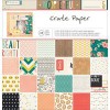
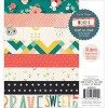
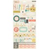
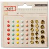
SUPPLIES
(affiliate links)




No comments:
Post a Comment