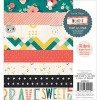
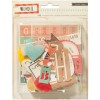
I have seen several people cutting up this adorable house paper and using it as a border, and I love it, so I did it too. :) The promenade had lots of cute beach houses all along it, so even though the houses on the paper don't look beachy, I felt like it went well enough with the theme of the layout. I really like the embellishments on my layout to add to the story, but I don't want to get too nit-picky.

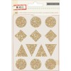
I used the gold glitter shape stickers to make a banner at the top to balance all the busy-ness at the bottom.
I really love the way my brush script turned out on the layout I did a week or two ago, so I brought it back here and I really dig it.
I covered up the globe that said, "A little note for you" with a die cut circle and a little banner so it would fit the layout a little better.
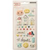
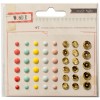
I typed up some journaling strips to fit the gap between the houses and the title. There was a little bit of extra space, so I filled it with a row of enamel dots. The large ones are harder for me to use, so I felt pretty proud of this.
If you want to see how the layout came together, watch the process video on my YouTube channel, or right here:
As always, all available products are linked below. Thanks so much for stopping by!
SUPPLIES
(affiliate links)













I'm so jealous you got to go there and see all those beautiful houses! This is amaze-balls. As always.
ReplyDelete