For today's Collection Disconnection layout, I'm sharing a very simple layout. Very simple. For me, anyway!
You know how some collections come with lots of items that say the same word? I find that happens often. I decided to capitalize on that here. I actually had a few other things that said "Hello" on them, but decided not to include them. I think it's fun to either use a word or phrase once on a layout, or go completely overboard with it. Even though "Hello" only shows up twice, the fact that it's huge qualifies this as overboard for me. In a good way. :)
I went with a column design and I really love the way it lets you showcase a cute pattern without losing focus on the important stuff. I decided to use up those tassels and I think they work really well paired with the banner paper. I didn't adhere them or anything, so they are kind of just floating on that string and doing what they want. And I like it.
The layout is all about how I want my daughter to stay little. How I don't want her to grow up too fast. Because of the subject matter, I purposely chose a single, smaller photo to tell my story. It's 3x4, but I overlapped the journaling with the photo, so it really looks more like 3x3. I know a lot of people like to include lots of photos and have a hard time with small, single photo layouts. I myself try to have at least a 4x6 when I'm scrapping a single photo layout. But, there are always exceptions. :)
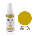
I added a few gold glitter circle stickers (cut in 1/2) and a tiny bit of Heidi Swapp color shine in gold to finish it off. If you want to see how it all came together, you can watch the process video on my YouTube channel or right here:
As always, I've linked to all available products below. Thanks so much for taking a minute to stop by!
SUPPLIES
(affiliate links)









No comments:
Post a Comment