Last week I talked about how you can run with a phrase or motif that is echoed across the products in the collection. Today, I went all out on the cats. And I kind of love it. :)
I made a loose line of cats along the right side of my layout. I purposely placed them so the cats that were looking to the right were closer to the center of the page and the cat looking to the left was on the outside. Hope that makes sense!
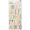
I used the adorable "Charm" Thickers for my title. I didn't have an "R", so I made one out of a "P" and an "X". Looks good to me.
Of course I had to include the cat die-cut and the cat paper! I've always been wary of a red and yellow layout (because it reminds me of McDonald's), but I think it works well here. Those felt hearts were perfect.
If you want to see how the layout came together (which was very quickly!), you can watch the video over on my YouTube channel or right here:
As always, I've linked to all available products below. Thanks so much for stopping by, and look for a giveaway with the final layout in the series next week!
SUPPLIES:
(affiliate links)











Cute LO!!! Loving the Collection Disconnection series!
ReplyDeleteThis comment has been removed by the author.
ReplyDelete