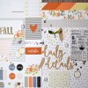
On this layout I recorded the details of a drive in the beautiful Smoky Mountains.
Did you know that Felcity Jane is in the Silhouette Online store? I used the leaf background cut file and I love it!
I smooshed some distress ink on the background and laid the leaf cut file over the top. So pretty. So autumn-y.
The title is a mixture of the intricate wood shape and a circle from the cut apart sheet. I gave the wood a white-washed look by adding white pigment ink (mine was the Joann store brand) and then rubbing it off.
I added lots of interest to the photo by layering up patterned papers, a 3x4 card, tags, vellum feathers, flair, a paperclip, a tab, and some sequins. Woah!
Finally, I added a bit of stamping. "that one DAY" fit perfectly on that little tab and some circles stamped tone on tone added interest to the background.
If you want to see how the whole layout came together, be sure to watch the process video below, or over on my YouTube channel.
I've linked to all available products below. Let me know if you have any questions and thanks for stopping by!
SUPPLIES
(affiliate links)


Beautiful layout. All the details, including the leaf background, work perfectly with the lovely photograph. I like the way you have made the title up from the wood shape and the circle.
ReplyDeleteJust the most delightful layout Jen!
ReplyDeleteThis is amazing!!! One of my top ten faves of yours.
ReplyDeleteI just love how the inking looks behind the cut file! Also I open up my tiny attached and staple in the middle of the page ...you just need to manually close the backs of the staples.
ReplyDeleteI adore this layout !
ReplyDeleteLove your layout, the inking behind the cutfile, the little details. Great.
ReplyDeleteI appreciate you sharing this article.Really thank you! affordable seo
ReplyDelete