In the spirit of things, the other night my daughter and I cranked up the Christmas tunes and made some holiday layouts. I used my November Old Meets New stash kit to create three layouts. I took lots of close-up photos, so here's a look...
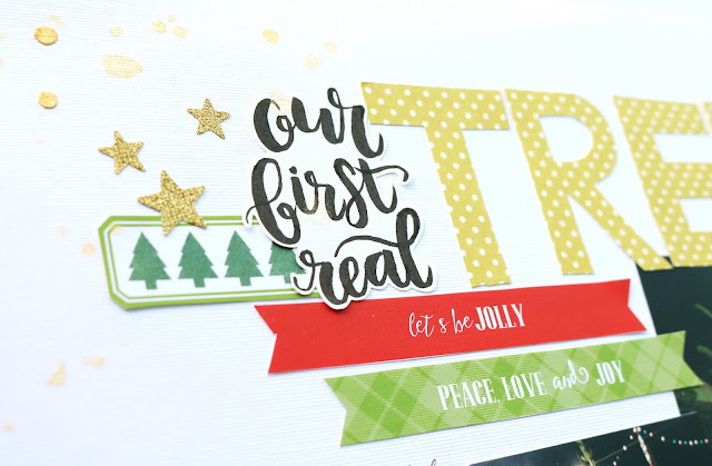
Our First Real Tree
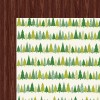
This layout focuses on that adorable tree patterned paper from the Shimelle Christmas Magic Collection. I made a forest of sorts, by hand cutting the rows of trees and then layering them together.
I created the title with a bit of brush script and hand cutting patterned paper. Sometimes you need something specific and it's nice to be able to make it yourself. :)
I added a few embellishments, washi tape and the date at the bottom.
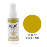
Of course, I finished it off with some much needed gold Heidi Swapp Color Shine...
I've linked to all available products here:
Big Guy
We always take Mal to go see Santa, but we never take photos with him anymore. It's just not worth the money, plus our mall Santa dresses in his "workshop clothes" which consist of a blue flannel shirt and suspenders. I want classic Santa - are you with me?
I matted my photo with a few layers of cardstock and patterned paper and left a bit of a larger border at the bottom of the photo so it looks like a polaroid. That was a good home for Malia and my niece Amaree's names. Those gold alphabet stickers came from my stash (Teresa Collins Studio Gold).
I also pulled a few label stickers for journaling, some enamel dots, and some mist from my stash. I try not to be too restrictive when I'm using a homemade kit.
Again, I did a bit of brush script for part of my title and added in some Thickers from my stash because I wanted a bit of cream.
All available products are linked here:
Sweet Angel
This last one is my fave and I actually made a page and a half. The first photo was so airy and light and I really wanted to show off that gorgeous paper! So I decided to throw the journaling and the other photo onto a half page, which I haven't done before, but I will definitely do again!

To create unity between the two, I repeated elements of the design on both sides. I layered up a bunch of papers, including printer paper, cardstock, vellum, and even a glassine bag beneath each photo. I love the way these layers add texture, but not a lot of weight because they only vary in color very slightly.
To balance the aqua in the trees on the main page, I added a little hint of aqua cut from a Shimelle paper to the left of my half page.
I also repeated the title treatment, the canvas star, and silver thread nests.
I added just a bit of silver embossing, silver star rub-ons, and some silver and blue ice splatters, which are absolutely gorgeous in real life.
Again, I've linked to these products here:
I created a little layout share and my daughter is also sharing the layout that she made at the end of the video! You can watch it below or over on my YouTube channel.
If you have any questions, just leave a comment. Thanks so much for stopping by!












Jen, your page and a half is my favorite layout of yours ever! I just love how light and ethereal it looks. I also really love the tree and Santa layouts! They're so festive and definitely put me in the holiday mood.
ReplyDeleteMalia, your layout is gorgeous! I loved hearing you explain why you choose certain things for your page. Thank you so much for sharing your talent with us! I hope to see more layouts from you in the future!
I just now had a chance to watch this! I love all three of your layouts and Malia's. I LOVED hearing her little voice! Please have her share something again soon! :)
ReplyDelete