They were actually really fun to create! I made a little Kill a Kit video showing you all of the layouts I created (there are six that I haven't shown before now) and what I have left over from the original kit. You can watch it here, or over on my YouTube channel.
Here are close up photos of the six new layouts. I'm just going to point out a few little details about each layout, but be sure to watch the video if you want to hear more about them! I've linked all available products below each layout. If you want to see the other layouts I created with this kit in more detail, check them out here, here and here. You can see the original kit here.
CHRISTMAS COOKIES
I used a piece of Shimelle gold star vellum for the background of my layout. Stars + Christmas = perfection.
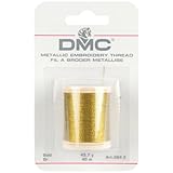
I also cut little banners out of green cardstock and stitched them down with some gold thread.
SUPPLIES
(affiliate links)
COMFY PILLOW
This layout was all about using up some tags. I've done this before & I think a tag grid is fun. :)
I used a little bit of brush script near the title and the journaling. I love doing that when I can't quite find the lettering that looks right.
SUPPLIES
(affiliate links)
LUNCH
I wanted that Shimelle paper to be on show for this layout, so I kept all of my embellishment close to my photo.
I had a cute label that said friends, but I needed another one, so I just wrote games and made my own. Easy peasy. :) I also did a little brush script for my title and cut it out.
This is a layout about a work lunch I had when I worked at Close to My Heart, so I thought it only fitting that I use some CTMH products. The flair and that berry chipboard are both from CTMH.
SUPPLIES
(affiliate links)
WAITING
This design is a great way to use up a bunch of scraps once you are getting toward the end of the kit.
I cut a bunch of 2" squares and cut them in half diagonally to create triangles. Then I just layered them up at the top. It kind of looks like a rooftop or something.
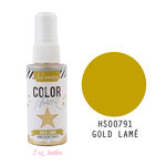
I added an insane amount of Heidi Swapp gold color shine...I regretted it later, but too late now! I do really love the way the color shine looks on top of photos.
SUPPLIES
(affiliate links)
MARY & MALIA
This layout is very gold! I layered up a bunch of different white papers under the photo to create a large, messy photo mat.
I hand-trimmed the phrases that I put in a line on the left side of the layout from an October Afternoon paper.
SUPPLIES
(affiliate links)
3 SIZES
This layout's title plays on a quote from The Grinch Who Stole Christmas and I love that. It's a photo of my kid, my brother's kid, and my sister's kid. :)
I added three little glitter hearts and hand cut a large heart out of cardstock and patterned paper with three layers.
I love creating interest with a lot of layers behind my photo (if you hadn't noticed...)
SUPPLIES
(affiliate links)
Thanks so much for stopping by! If you have any questions, leave a comment below!














You are a scrappy rockstar. I love all of these! Amazing! Your hand trimmed titles are my fave ever. I do not see how you do that so perfectly.
ReplyDeleteGorgeous layouts as always!
ReplyDelete