I had three photos, so I made a grid and let the fourth frame house my title and journaling. I knew from the get-go that I wanted a pretty clean and simple layout, so I chose a white embossed dot paper from Bazzill for my background.
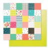
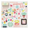
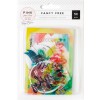
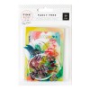
I embellished simply with some flowers cut from papers and an acetate piece from the embellishment pack. I framed the layout with some of the gorgeous painted circle paper and machine stitched down the sides.
If you want to see how the layout came together, check out the process video below.
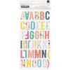
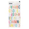
I've linked to all available products at the end of this post. Thanks so much for stopping by and come again next week for the final layout in this series!







Really beautiful and simple layout Jen. Thank you for sharing with us! Here is something I struggle with - maybe you can help. If I was making this layout, I would feel like I should be putting a third grouping of the watercolor flowers somewhere to make a triangle - using the design principal of a visual triangle. I know you have the little green tab/circle so that makes a triangle and I totally overthink things sometimes. This is why it takes me forever to get layouts done. I love how yours looks so would be interested in your thoughts about this. Maybe it will help me just move on... :)
ReplyDeleteThis was great to read
ReplyDelete