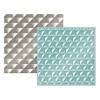
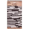
I decided to do a little throwback and use some photos from when my daughter, who is almost 11, was just 10 months old! I decided that because I wanted to include so many different kinds of texture and interesting elements, that I would stick to the top half of the layout and leave the bottom half kind of open for some visual rest.
You can find out all the details about how this layout came together in the process video below!
Feel free to leave a comment if you have any questions, and don't forget to check out Tracy's class, Mercy Tiara's Take Ten: Textures! Thanks so much for stopping by.
SUPPLIES
(affiliate links)


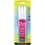
Love the layout...it is beautiful!!!! The while pen around the stencil looks fantastic :)
ReplyDeleteHeee heeee!! "Throwback".... Love it :)
ReplyDeleteAnd this layout-- I LOVE it, too! Wow-- all the layers, all the texture. It is gorgeous in the photos and the video, and I bet it is even more stunning in person. You make me want to get out some paint and try to get messy. It's not my forte, but boy, you make it look amazing. And the white pen doodles! ::swoon::
~natalie from Vegetablog
I am happy to find this post very helpful for me.
ReplyDeletesanitary design inspection