But worth it.
I started this layout knowing that I was going to spend a significant amount of time hand-cutting little leaves out of patterned paper. And I did. Over an hour, in fact. But I think it was totally worth it.
I have been seeing people creating all sorts of beautiful wreaths on their layouts and it's been a while since I did one myself. So I gave it a go. I used a cute series of photos of my daughter throwing leaves in my face and printed them so I could make them look kind of like a film strip. I think that's a great way to tell a story in sequence.
I layered up a TON of leaves. It started out as a mixture of leaves cut from a white + copper foiled patterned paper and that gorgeous Maggie Holmes paper with the birds. I love that it looks autumnal but still has soft, pretty colors. Then, to bring a little richness, I flipped over the Maggie Holmes paper and die cut some geometric leaves from the leather-looking side.
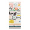
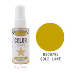
I sprinkled in a mixture of chipboard, stickers, sequins and, of course, some gold splatters.
I created two larger clusters - one on the top right and one on the bottom left. They each had birds and a bit more foliage. I think that helped to balance the wreath, but in the end, I feel like it turned out a little squarish. I don't know why, but circles are hard!
It took a while to arrange all of the leaves, but I found it helpful to lay down a base layer (the white leaves) and then tuck all of the other leaves and elements into it to create beautiful layers.
Even though this is a fall layout, I wanted to keep it light and fresh looking. The soft colors of the papers helped, but I think doing the title sort of tone on tone was a good move as well. If you want to see how the whole layout came together, watch the process video below!
SUPPLIES
(affiliate links)












You helped me with advice!
ReplyDelete