I had to photograph it in the page protector, so pardon the glare. I cut down a page protector to fit the 5x7 photo, stitched the sides and eventually stitched it to the outside of the page protector.
I included my journaling on the flip up and I like the way it turned out. I have to admit that it felt weird not including my journaling on the main part of the layout. Just a little.
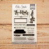
I used a mixture of stamping and hand-cut letters for my title. I love customizing things like that and it's pretty simple. I also added black stitching in various places for a bit of contrast. I added a few blue hearts to make the photo tie in with the rest of the layout.
On the flip-up with the journaling, I added another pop of blue and some black stitching to make sure it coordinated well.
When I was almost done with the layout, I really felt like it needed another pop of turquoise, so I added some stamping and called it good.
You can see the entire layout come together in the process video below.
I've linked to all available products below. As always, thanks for stopping by and spending some time with me. I truly appreciate it! Let me know if you have any questions!
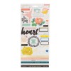
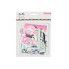
SUPPLIES
(affiliate links)






No comments:
Post a Comment