Today, my intention was to be inspired by the inspiration behind the collection - children's books. And I was inspired to tell a story about reading, but I also decided to show you how I tackle the idea of using a bold and bright patterned paper for the background of your layout.
I find that the best way to make sure your photos stand out while still letting your bold pattern shine is to break it up with a solid color. I tend to gravitate toward white and in this case, I used notebook paper.
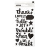
I combined a few words from the Thickers set to create my title, "Magic Adventure". I like that the title is white and I think if it were a different color it would compete with the background paper.
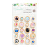
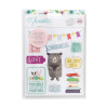
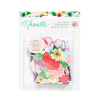
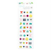
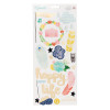
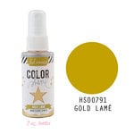
I pulled elements from the die cuts and sticker sheets to lend to magical, fairytale, getting-lost-in-a- good-book, feel and finished with a little bit of gold mist because, gold=magic.
You can see how it all came together in the process video!
I've linked to all available products below and don't forget to check out the other videos in this series on my YouTube playlist!
Thanks so much for stopping by!
SUPPLIES
(affiliate links)



Dare I confess that I bought the die cut pack ONLY for that stack of books??? I love it. I wish I had about 12! :) Love your layout!
ReplyDeleteNice and very helpful information i have got from your post : learn more
ReplyDeleteShowBox is a great new app that lets you stream as many videos as you like. What is best is that there are no limits attached, and the files can also be downloaded safely to the device.
ReplyDeleteI can watch movies anywhere I like and watch them on the go. Plus there are new releases added every day. To know more about this app please click here ShowBox App Download
Thanks for sharing amazing information !!!!!!
ReplyDeletePlease keep up sharing.
This is great article. I like that
ReplyDeletePolish Dentist In Clapham Junction
This is very interesting, the way you describe it.
ReplyDelete